I’ve started looking at using AirBnB a bit more for my travels. This week I’ve only really had a good poke around their website. Previously I’d spent my time browsing AirBnB through their mobile apps.
There’s a lot of neat – and read ‘neat’ as ‘useful’ as well as ‘tidy’ – user interface stuff on there. Well worth checking out.
One bit really caught my eye: The design of the page for the spaces you are looking at maybe booking.
Here’s a grab of a the bulk of a space page.

There’s a lot of content in there: Pictures are used to show the spaces off, and the rest relies on words. A lot of it relies on words. There’s some titled icons in there to help break things up, again neatly, but there’s a lot of words. And there’s a neat trick employed to cut the number of words down – and allow the user to bring more content into play when needed. Some good use of space, by the way. Not sure if there is a pun here, design or otherwise.
The layout just feels tidy. It just feels… neat.
Part of that neatness comes down to the Amenities section. AirBnB offers you spaces in people’s homes. Sometimes you’ll be browsing their whole home, other times just a room with access to some facilities. Pictures are all good and well, but what do you have access to?
Here’s that.
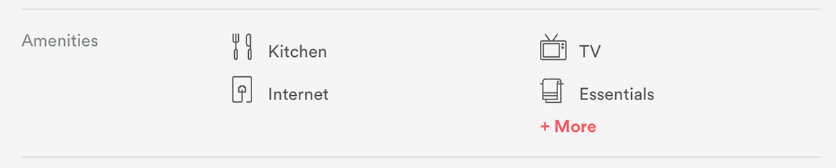
Again, neat, tidy, and kept to a 2x2 grid. Neater still is when you click More. The site reveals a list of all the options, with the relevant ones using bolder type and an icon, and the non-relevant struck-out and with less bolder weight.
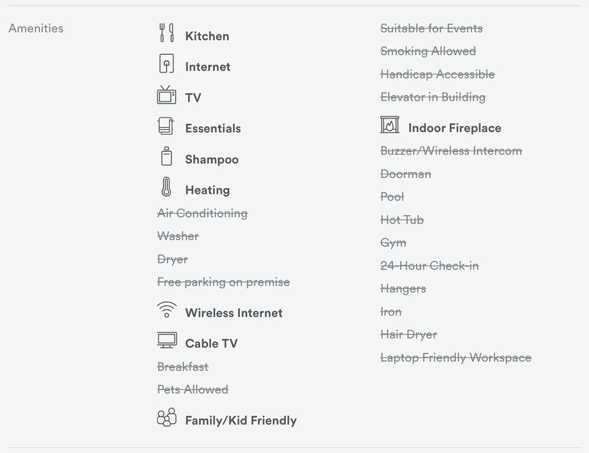
Showing all the options. Showing what you get – and then showing what you don’t get. No ambiguity. Clear isn’t it?