Several days back it was Ryan Gosling’s birthday, the cue for design people on Twitters to reshare the Papyrus Saturday Night Live (SNL) sketch from a couple of years back.
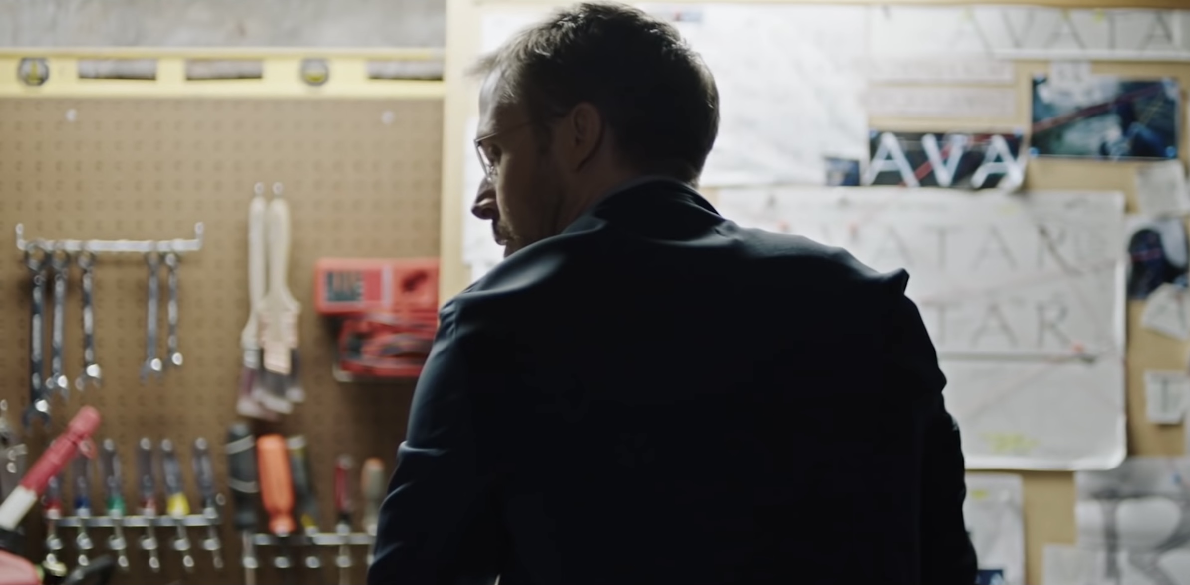
As a sketch it is a good laugh, and there’s a few really great moments — Gosling in a conversation asks what the font is and is told the Avatar logo looks tribal yet futuristic — but scrolling through Twittter for a moment it felt like a no disrespect to the likes of Grimsby for typefaces and fonts, Papyrus being the fall guy, the butt of this popular joke (at least on Design Twitter™). Papyrus very rarely gets even the slightest public respect. Snark is all too easier compared to some positive feedback. I think respect is due.
Papyrus, is one of the most widely available, most widely usable and most familiar typefaces, included in Windows and Macs’ operating systems for too long. As the SNL sketch skits the word Avatar was just typed into Word, highlighted and Papyrus was chosen, like many people have done. Those actions were amongst some of my earlier ones working with typefaces on computers, at least when I shifted from my Amiga to Windows machines, having to rely on the operating system defaults.
Yes, I have a softer spot for Papyrus. Its calligraphic nature brings through rougher edges to the letters as well as irregular curves and angles, contrasting starkly with the more Swiss style typefaces so prevalent now. But I find chunks of content set in it quite readable. There’s been times in the past I’ve selected all the content in a Word document and reformatted it to Papyrus.
Calligraphic typefaces get a raw deal, but hey I’m the kind of person who doesn’t find Roger Dean’s Yes album covers and Psygnosis game covers offensive.
The context of Papyrus’s creation is also worth mentioning, designer Chris Costello’s creating it in downtime at his first job out of college, while he was immersed in a journey for God.
That people also can name Papyrus by sight — like Comic Sans too — should get some credit, a typeface committed into the popular consciousness. All aesthetics are subjective: Whether you like them or not is your call. But there’s a wider usage of Papyrus that overrides any practicing graphic designer. If the audience didn’t like it would the audience still use it?
Which brings me back to the Avatar thing in the SNL sketch. Avatar remained the highest grossing movie of all time for the best part of ten years, until Avengers: Endgame came along. That the choice of Papyrus for the logo didn’t dissuade that many people from seeing the movie feels more of an endorsement for Papyrus.
So, maybe it’s time Papyrus should get some of the respect it deserves, as begrudging as that might be. Laugh along sure but also give some air time — acknowledge! — the usefulness of Papyrus as a typeface in the wide world. It might not be your thing but it feels like it’s other people’s thing. Down with your design elitism and snubbing Papyrus, up giving some overdue credit!
I hope typing this little post does a little towards that.